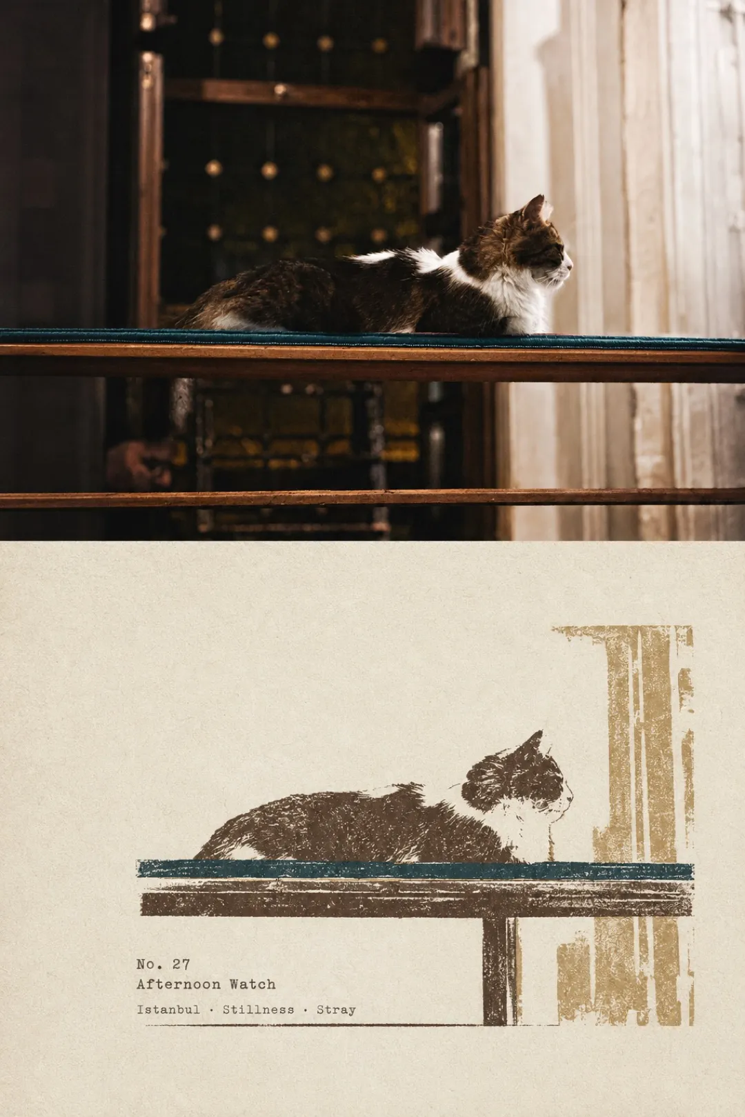
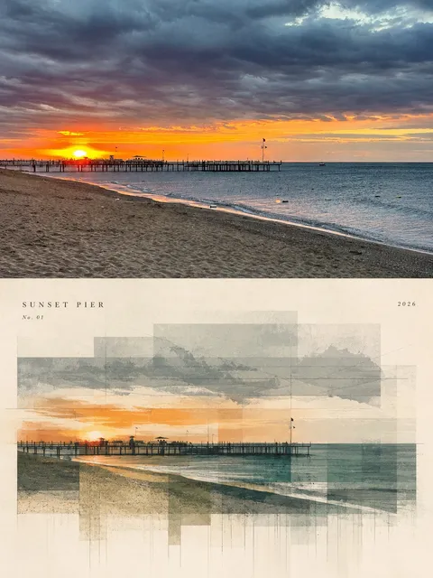
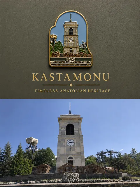
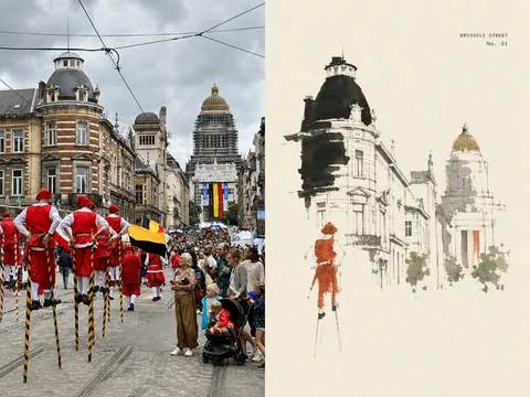
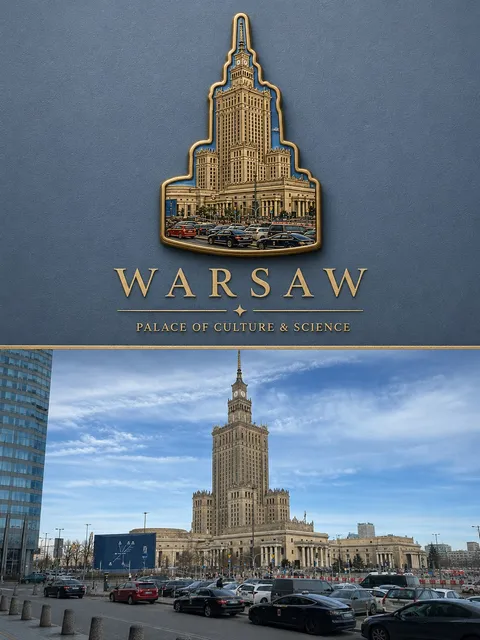
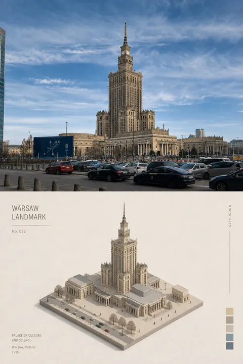
Create each uploaded photo as a separate, independent high-end design poster. Do not combine multiple images into one composition; each photo must be output individually. Use an overall 3:4 vertical layout, divided into two equal sections from top to bottom, with a strict 1:1 height ratio so that each section occupies exactly 50% of the canvas.
Upper Half
Retain the original photograph in the upper half, preserving the main subject’s structure, authentic texture, natural light and shadow, and original color atmosphere. Apply only subtle high-end color grading and delicate film grain so that it feels like travel magazine photography, art publishing, and field-documentary photography. To fit the format, the surrounding environment may be naturally extended or cropped, but the main subject must never be stretched, distorted, or altered.
Lower Half
In the lower half, extract the most recognizable subject, silhouette, posture, spatial relationship, and narrative characteristics from the photo, and reconstruct them as a refined multicolor rubber stamp image. Do not fully replicate the original photo. Remove irrelevant details and preserve only the most representative structural forms, directional flow, and visual memory points of the subject. Use silhouette, flat color blocks, carved lines, and a small amount of layering to create a distilled graphic interpretation, so that the relationship between the upper photograph and the lower stamp remains immediately recognizable.
Composition
Maintain a relationship between a small-scale stamp impression and large areas of negative space. Position the stamp freely according to the subject’s direction, proportions, and visual center of gravity. It may be off-center, close to the edge, or partially cropped, as long as the composition preserves clear hierarchy and editorial balance.
Color
Extract 2 to 4 of the most distinctive colors from the original photo and translate them into restrained yet expressive spot-ink colors. Build visual layering through overprinting and registration relationships. Do not use any fixed travel-themed palette.
Stamp Texture and Materiality
The stamp should preserve the authentic feeling of hand-carved and hand-printed craftsmanship, including:
* uneven carved lines,
* broken ink coverage,
* visible paper show-through,
* grainy ink texture,
* chipped edges,
* pressure variation,
* and slight misregistration between color layers.
Use a warm light paper background with subtle fiber texture. Avoid smooth vector cleanliness, digital filter effects, or a childish handmade-craft look.
Typography
The text should feel like field notes left by a traveler or observer. Based on the location, subject, condition, or imagery of the photograph, create a short English title, accompanied by a No. index number and 2–3 keywords or a very brief note. Use a small typewriter-style font or archival micro-typography. The text may align subtly with the edge of the stamp, areas of blank space, a baseline, or part of the silhouette, so that it becomes part of a recording system rather than a commercial headline.
Overall Style
The overall result should express a visual relationship of real photography × handmade rubber stamp × travel field notes. The tone should be quiet, restrained, rustic, refined, and collectible. The photograph records the real scene; the stamp preserves the most memorable and identifiable essence of it.
Avoid:
* souvenir-shop aesthetics,
* postage-stamp templates,
* circular stamp designs,
* sticker collages,
* cartoon styles,
* excessive text,
* and decorative clutter.
Copy prompt