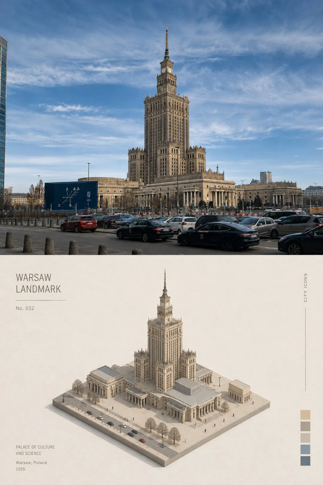
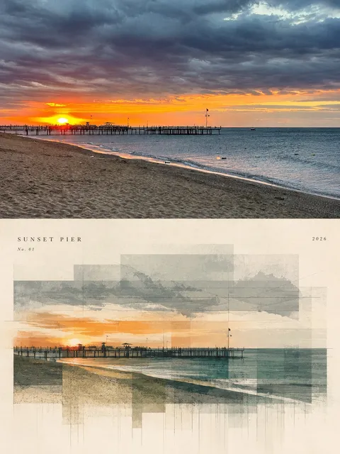
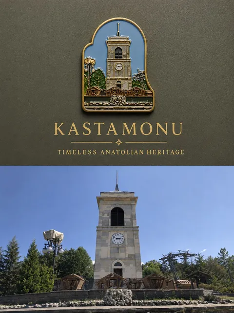
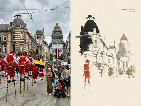
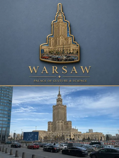
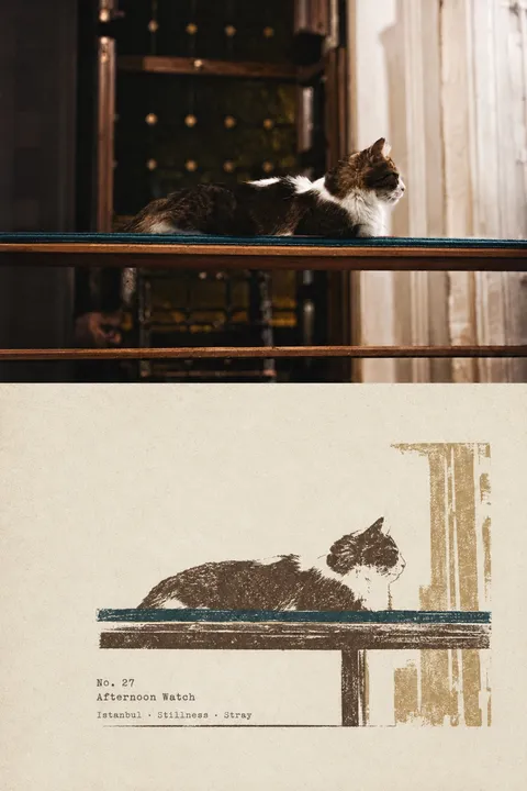
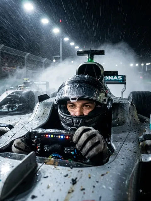
Please turn each photo I upload into a separate, standalone high-end design poster. Do not combine multiple images into a collage; output each photo individually. Use an overall 3:4 vertical composition, with the upper and lower sections divided in a strict 1:1 height ratio, each occupying exactly 50% of the canvas.
The upper half should preserve the original photograph, maintaining the subject’s structure, realistic texture, natural lighting and shadows, and the original color atmosphere. Apply only subtle, sophisticated photographic color grading to give it the quality of an art magazine, independent publication, or exhibition photography. To adapt the image to the required aspect ratio, you may naturally extend the sky, ground, or surrounding environment, but do not stretch, distort, or alter the main subject.
The lower half should extract the most recognizable subject, silhouette, posture, and narrative relationship from the photograph and reinterpret them as a refined minimalist isometric illustration, resembling a miniature three-dimensional model or architectural maquette displayed on paper. Do not mechanically reproduce every photographic detail. Instead, reinterpret the subject using simplified geometric masses, clean edges, clear visual hierarchy, and miniature scene relationships. The result should remain instantly recognizable while expressing a quiet, restrained, poetic editorial-illustration quality.
Use the visual logic of an isometric miniature landscape and paper-model composition: the main subject should appear as though it has been carefully cut out and placed onto a small sheet of paper or miniature platform. Surround it with generous negative space. Establish scale and a sense of solitude through proportion, cropped edges, subtle shadows, and only a few tiny supporting details. A very small number of secondary elements may be added to support the main subject, but they must never become a second focal point.
The color palette must be derived entirely from the original photograph above. Prioritize the most distinctive, elegant, and representative colors of the subject, then simplify, refine, soften, and unify the complex colors into a limited palette. Preserve the original image’s warm-cool relationships and color personality, while reducing visual noise and unnecessary color variation. The palette should feel calm, restrained, soft, and appropriate for an editorial illustration printed on paper. Use tonal variations of the same color family, neighboring hues, and subtle color differences to distinguish forms. Do not introduce a fixed palette or unrelated colors that are not present in the original photo.
Use fine ink-like lines, flat color planes, subtle shadows, and delicate paper grain to express structure and depth.
Typography should be integrated intelligently as part of the composition. Derive a short English title from the photo’s subject, location, action, state, or mood, and pair it with only a minimal amount of numbering, short phrases, or micro-annotations. Typography should be thin, restrained, modern, and editorial. It may be positioned along the edge of the negative space, on the miniature base, along a horizontal axis, or aligned with the isometric structure, so that the text and graphics work together to create a quiet and refined visual rhythm.
The overall reference direction should combine minimalist isometric illustration, miniature three-dimensional models, paper landscapes, and high-end editorial design, creating a visual atmosphere that feels quiet, poetic, restrained, sophisticated, and collectible.
Avoid cartoon-like styling, highly saturated contrasting colors, fixed palettes unrelated to the source image, plastic-looking 3D rendering, overly complex scene-building, e-commerce aesthetics, and generic template-like design.
Copy prompt